The last couple of weeks have seen some interesting adverts being released by three big tech companies.
Nokia – what were you thinking? So your tablet works for both work and home life and you think a mullet is an effective way of highlighting this? Reminds me of the weird ad’s that Sony used for the PS3. The only play seems to be let’s do something different to let people know we are still around. Worst tech advert of the year? No.
What the fuck? Buy a Galaxy Gear and you too can be a stalker? Were the actors paid to be deliberately wooden? I know Samsung spend a lot on adverts, but where is the quality control?
Finally, Apple.
Cheesy video but sets the right tone for Christmas. After watching these three ad’s which product would you rather own?
Samsung copies much of what Apple does, right down to the S4 being released in Gold, but in so many ways I’m glad they are polar opposite of everything that Apple does.
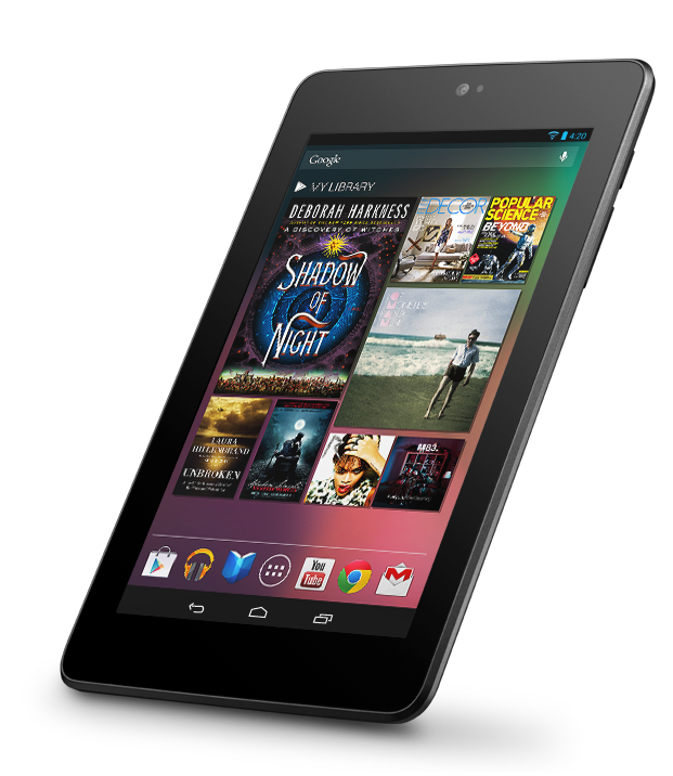
The original Google Nexus 7 is now 12 months old and has been replaced by a new version that has upgraded much of the tablet – retina screen, faster CPU, more RAM and a camera. Considering it will be only £20 more than last years model that’s quite an upgrade for an affordable tablet. I’ve had my Nexus 7 for just over 9 months and while it’s been a good device the overall experience makes it hard to really recommend an Android tablet.
Performance
One of the big selling points of Android 4.2 was Project Butter. Finally Google had addressed underlying performance issues so that there would be no stutter, scrolling everywhere would be smooth and Android could finally be viewed as an equal to iOS from a performance perspective. 9 months on and I have to say that there is still a considerable performance difference between Android and iOS.
On the Nexus 7 the performance issues have been exaggerated by an overall slowdown over time. This has been well documented and I was seeing it too. I’d launch Chrome and it would sometimes take 20 seconds just to launch and show the 2 or 3 tabs I had open. I tried many of the cleaner tools that are in the Google Play store and while they had an impact for a week or two the system would eventually fall back to it’s usual slow self. Thankfully Android 4.3 has enabled trim support and this has certainly had an impact over the last week but there is still a noticeable lack of smoothness throughout Android as a whole and I’ve got no faith that the stuttering won’t get worse again over time.
Can Google keep the new Nexus 7 from the same fate? At the moment, it’s very fast. Powered by a hefty 1.5GHz Snapdragon S4 Pro processor and 2GB of RAM, it flits around the OS with ease, and I rarely encountered stutters, jitters, or problems of any kind. (Except scrolling. Cool job Google.) – Google Nexus 7 2013 review
Even one of the most glowing reviews of the 2013 Nexus 7 acknowledges that it still has performance issues at a fundamental level. Well played Android.
When things go wrong
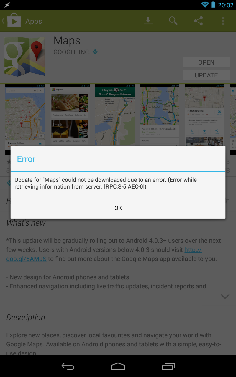
Android’s flexibility is fantastic, especially when compared to iOS. However when things go wrong it feels like you are dumped back a decade when trying to fix it. Just this week after applying Android 4.3 I hit a major issue – I couldn’t update any applications from the Google Play store. Worse, the error message was gibberish.
I tried switching off and on but it made no difference. To the internets, where it was clear that lots of people suffered the same problem and were stumbling through various fixes to try and solve the problem. I first tried the following fix:
Open system settings
Go to Applications (or Apps) >> All
From all apps select Google Play Store >> Clear Cache and Uninstall updates
Again, from All>>Download Manager >> Clear Cache and Data
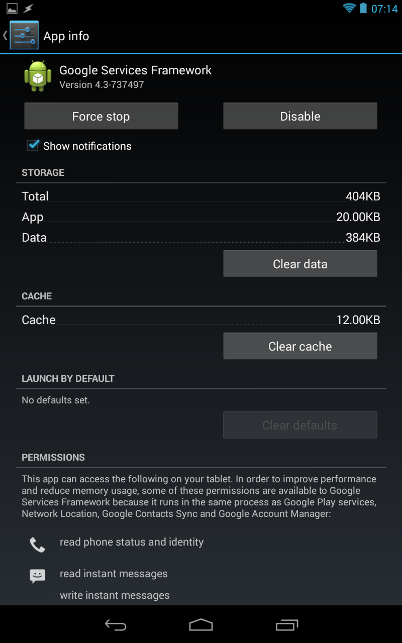
Finally, All >> Google Services Framework >> Clear Cache and Data
Now, rerun Google play store.
No dice. All applications would fail to update. So then it was onto the next fix all the while thinking that this felt like trying to fix an issue on Windows 95.
Things aren’t going well if you are having to use this screen
Go to system settings>> Accounts>>Google>>remove your Gmail account
Now from settings>>Apps>>All> Force stop, Clear data and cache for Google Play Store, Google Service Framework and Download Manager (like in method 1)
Now again go to settings>> Accounts>>Google>>Add your gmail account
Restart your android and then accept all the Google terms and setup Google settings
Rerun Google Play Store and update or install your app.
That almost fixed the problem except I couldn’t update Google Maps as it failed with the same error. Sigh. I tried again this morning and still had the same problem. So I wiped all accounts from the Nexus, wiped data on the Google Play Store and Google Services Framework applications, rebooted the Nexus and then added my primary Google account. Finally I could update Google Maps. What a farce. This isn’t the first time I’ve had issues that forced me to clear caches from applications to get them back running properly again and it’s one of the reasons I don’t recommend Android tablets to friends and family as the support time is far higher than with iOS.
Ecosystem
Application availability, especially for tablets, is still stronger on iOS than it is on Android. 99% of the time app’s will release first for iOS and generally be the better version. This hasn’t really improved over the last 10 months. I’m sure for phones it’s different but I can only compare what I use which is iOS and Android tablets. The exclusives are to be found on iOS and there is still a richer ecosystem on iOS when compared to Android.
Should I buy a Nexus?
That depends on who you are and what you want to do. Want to customise your device, root it, make it your own and happy to mess around when things go wrong – the Nexus 7 is great and the new hardware looks superb for the price. For everyone else I’d recommend iOS without any hesitation. Superior experience, great performance and devices that in general just work. I still fire up the Nexus from time to time but I’m really back on the iPad even for reading despite the size and weight. Speed wins.
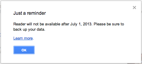
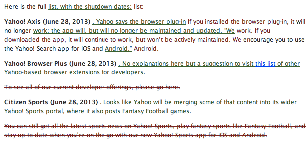
So tomorrow Google will shut down Google Reader. I’m sure for many this is a non event but for me it’s been an essential tool for years that I will really miss. However this isn’t the end for RSS feeds as has been reported. Instead there’s been a surge in new services and app’s taking advantage of Google leaving the market.
Farewell Google Reader
Before looking at alternatives the first thing to do is back up your subscriptions via Google Takeout. With that step complete you can then try out the many alternatives that have sprung up oner the last few months. Here’s my thoughts on the few I’ve tried over the last few weeks.
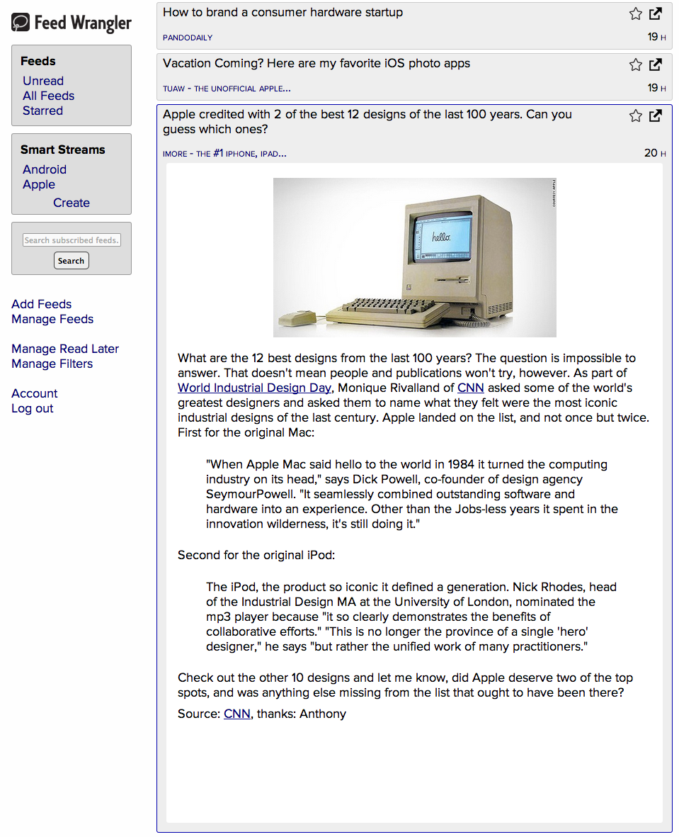
Feed Wrangler Feed Wrangler takes a different approach than the many other Google Reader clones. Feed Wrangler is a website where you can import and view your feeds and the developer has also released app’s for iOS and also an API so that app’s like ReadKit and Mr Reader can be used to sync your feeds. Once your feeds have imported you will notice that there are is no folder or tag support. Your reach your articles by visiting Unread, All Feeds or Starred. I found this quite disorientating as I’m used to browsing the many feeds I subscribe to via folders/tags.
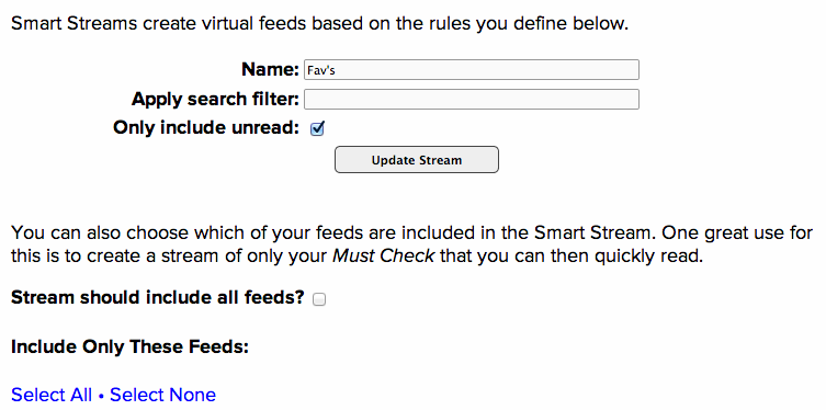
Feed Wrangler Smart Streams
Feed Wrangler’s most powerful feature is Smart Streams and that did allow me to create a folder structure that I’m used to. Create a new Smart Stream and once it is named you can select from all feeds or a select few to display in a Stream. The trick with Streams is that a search term can also be applied, so you could have a stream based on all your feeds that pulls out posts on Glastonbury or E3. While only search terms are supported right now, it would be great to see date ranges or authors supported so you can pull out articles easily from the past – Olympics from August 2012 for example. It’s also easy to add a Stream that pulls out your essential reads – those feeds that you don’t want to miss but when you’ve had a busy few days and faced with 2000 articles to read you want to quickly read those important ones only. Smart Streams is great for that.
News article within Feed Wrangler
Feed Wranglers presentation of articles is nice and clean. The UI doesn’t get in the way and the articles are presented well. Speed on the web app is good enough and there is similar keyboard shortcuts for Google Reader refugee’s. The iOS app’s are fairly basic right now but do enough although I’ve been mainly using other clients with Feed Wrangler so I don’t think this is reason alone to move to Feed Wrangler. Pocket, Pinboard and Instapaper are also supported as Read Later services.
Feed Wrangler costs $19 a year bought from the website or as an in-app iOS purchase.
Feedbin Feedbin provides an almost straightforward clone of Google Reader. It’s a paid service ($2 a month or $19 a year) and once your feeds have imported you will be immediately familiar with the web app and it’s layout.
Feedbin Layout
It supports keyboard shortcuts so you can easily navigate through folders and feeds. You can view articles in a couple of different ways but out of all the new services I tried I found Feedbin’s rendering of articles the worst by quite a margin.
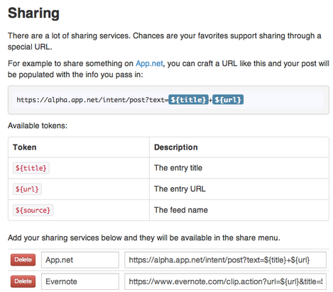
Sharing is very flexible as you can set up sharing to the service of your choice via URL’s. While this allows for great flexibility (and there’s a good list of URL’s on Github) in many cases it is no better than bookmarklets so it feels less integrated.
With Feedbin’s API in place app’s like Mr Reader and Readkit give you a far better reading experience than the web app but I found the overall performance of Feedbin slow compared to other services.
Feedly Feedly has been around for a while and was always an alternative to Google Reader but only if you wanted to use Feedly’s website or mobile applications. It also chased the magazine market in presenting feeds in a far more visual manner like Flipboard than what users in Google Reader are used to. However with the demise of Google reader they stepped up their offerings, focussing on features that Google Reader users will really appreciate and also providing a sync service for other applications to rely on.
Article view in Feedly
Getting your feeds into Feedly is really easy. Sign in with your Google credentials and feeds are sucked into Feedly as well as your Reader Favourites. Folders are respected so you will instantly feel at home in the web application. Keyboard shortcuts are mostly the same as in Reader but a few are different and annoyingly so.
In the web app there are a variety of views for your feeds and nicely they can be set differently for each folder. The views are Magazine, Cards (like Pinboard), Full and finally ‘Title Only View (Google Reader)’. Yes, thats what it’s called just in case you are in any doubt on the inspiration for that view. Presentation of articles is nice and clean and there is some minor customisation options allowing you to change link colours and overall theme colour.
Feedly does show adverts on it’s home page called Today but I’ve found the display of content on that page hit and miss however you can change your default page so you never need to see Today.
Feedly’s maturity as a service is best seen when it comes to adding and managing feeds as it’s all done via drag and drop and works really well – far better than any of the other new services.
The Feedly app’s on iOS are OK. They work well enough but I just don’t like the styling of the app’s. They’ve went their own route when it comes to displaying of feeds within a folder and it just feels wrong. The overall app isn’t smooth either. However with the addition of Feedly API there are now many alternatives for viewing Feedly on iOS or Android including Press, Reeder and Mr Reader.
The advantage Feedly has is size and hence scope. It supports almost all of the large sharing services, has great flexibility via IFTTT support and has developed tremendously over the last three or four months. It’s a free service and for many has become the easy alternative to Google reader.
Newsblur Newsblur like Feed Wrangler is trying to offer more than a traditional RSS reader normally would. It’s been around for over two years now and while initial versions were slow and the design wasn’t the best, the developer of the service has really stepped on the accelerator over the last few months to support the influx of users from Google Reader.
Newsblur Web App
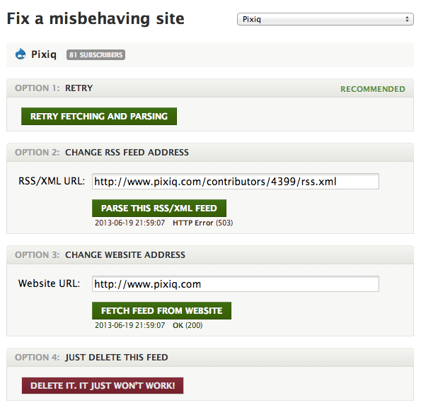
Importing from Google was easy and it supports folders so already familiar to Google Reader users. Keyboard shortcuts feel familiar and the web app has lots of shortcuts to mark content as read and also easily see how many articles are unread etc. Newsblur really offers a lot more than other RSS readers. On importing from Google Reader feeds that are no longer available or cannot be reached currently are marked with a yellow exclamation mark, with Newsblur offering options for dealing with the problem.
Newsblur presents options to fix unreachable feeds
I found articles were presented really well in Newsblur and also it works really quickly. Content is prefetched so I found articles were displayed quickly and accurately when moving through my feed list.
Article edits can be displayed in Newsblur
One feature not seen elsewhere is that article edits can be displayed to allow you to see how a site edits articles over time. Techcrunch has an amazing amount of edits for example – getting content out first still seems to count the most for some of these sites. Against each feed Newsblur can show a number of stats – tag counts, post frequency, subscribers etc. Not entirely necessary but nice to see.
Feed stats
You can also configure how each feed should be presented, so you could view a site in it’s original view if it’s been nicely designed and for those that are less visually appealing you can view just the story only in a simple text view. You can tweak fonts and font sizes and also configure Newsblur to open sites in new tabs. There’s also great support for sharing services with all the favourites nicely integrated and Newsblur also has it’s own social sharing service – Blurblogs.
Signing up to Newsblur will give you a site on the web that you can share stories to. People can comment on your shared stories and share on from that site. You can also follow other Newsblur users and follow their shares and you can see all your own activity in an activity list in Newsblur.
Train feeds to focus on only certain content
Newsblur differentiates from other services again by offering Intelligence Training. This feature allows you to select an author, tag or word from an article or feed and give it a thumbs up or down. Once this is done any article that matches a thumbs down will be hidden from view. You can still toggle the feed to view the hidden content but it’s another great way of weeding out good content from bad, especially for noisy sites like Techcrunch, Engadget or The Verge.
Newsblur subscribers can make use of iPhone and iPad apps which support all the features of the web app. There’s also an Android app too. The only feature I missed was offline syncing but that is coming in a future release. About the only other feature I can see that is missing is search but it took Google Reader a while to add that so that’s something I can pass on.
One final point is that Readkit on the Mac now supports syncing with Newsblur. Currently it doesn’t support training or much of the focus mode features but that is promised in future updates.
Newsblur is free for up to 64 feeds and is $24 for a year for unlimited feeds. I think it’s a great service and well worth consideration.
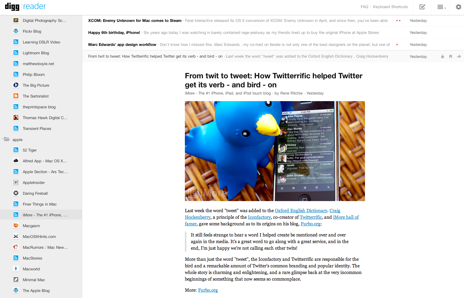
Digg Reader Digg Reader is probably the newest RSS service and in many ways it shows. Launched just a few days ago you pull in your Google Reader feeds by logging in with your Google credentials. It took a while to import and display properly but I’m putting that down to the service being hammered as Digg is still a big name and there’s not long now until Google shutter Reader.
Digg supports folders and so the presentation is very similar to Google Reader. Although articles are displayed cleanly I found it difficult to see what was new, what was unread etc. The site though was fast and considering it’s only been three months since the Google announcement it’s impressive to see what has been built.
Sharing options are limited though which is not a great surprise as Digg will want to build out their Reader around Digg and Instapaper which they now own.
Digg’s iOS app’s are fast and present articles cleanly. However there are no Android options at the moment and no third party support. If you like the Digg app’s you are in luck but if not there are really no options at the moment.
Digg Reader is free and although it’s early days I can’t really recommend it.
Wither Reeder Readkit on the MacOne surprise of the impending closure of Google Reader is how it’s affected the applications I use day to day. I never used the Google Reader website instead doing all my feed reading through Reeder for iOS and Mac and Press on Android. Press has been updated with Feedly support but surprisingly Reeder is falling behind the competition. iPad and Mac versions will be withdrawn from sale tomorrow while the iPhone version has went free with added sync support for Feed Wrangler, Feedbin, Feedly and Fever. The developer has decided to focus on new versions rather than update old app’s. While understandably the Google Reader change and subsequent lack of one standard replacement causes extra work it’s left a rather large gap in my feed reading process. Step in Readkit. This Mac only app was previously good for catching up on Instapaper and Pocket articles but version 2 brought in RSS support for Newsblur and Feedly with an update just a few days ago to include Feed Wrangler and Feedbin.
This has replace Reeder on the Mac and while it doesn’t have all of Reeder’s features and isn’t as fast as Reeder when syncing, it’s a far better experience than using the web apps of most of the services mentioned above. It’s only £2.99 from the App Store which really is a bargain.
On iOS I’m now using Mr Reader and Newsblur’s own app.
Conclusion
So which service replaces Google Reader? For most Feedly is the strongest option and it’s free so it’s a no brainer to move to that service. For me I much prefer Newsblur so that will be my RSS service of choice although I will keep an eye on Feed Wrangler as improvements to Smart Streams could be really big.
While it’s disappointing to see a service I use daily being shutdown it’s great to see some true innovation now that firms are competing on a more level playing field. Farewell Google Reader.
Apple and Samsung take contrasting approaches to advertising for two similar products – the iPhone 5 and the Galaxy S4.
Apple’s advert is aspirational, focussing on the user and how they get most out of the device and it’s app’s. It appeals to different type’s, from runners to food bloggers, travellers to kids. For me it’s one of their best adverts in years.
Samsung focus on their product but can’t do so without some unfunny dialogue and dinging the competition. Comes across as cheap. Maybe they aren’t trying to target me but that style of advert is a total turn off.
While Samsung have consistently copied the competition when it comes to their products I’m glad that hasn’t extended to their advertising campaigns. Yet.
I picked up my iMac back in 2011. As usual with Apple products I ordered the smallest RAM possible and picked up some Crucial to take it to 16GB. At the same time a colleague was also buying an iMac so I passed on the Apple RAM at a low cost to him as it was no use to me. That was my first mistake.
Over the last year I was getting infrequent crashes, every 2-3 weeks, almost always when iTunes was running. I put it down to software and looking at the crash dumps I was always drawn to a graphics card driver issue. I dismissed it as that, hoping an OS X update at some point would resolve it. It didn’t. That was my second mistake.
At Christmas I dug deeper, downloading a memory module checker and checking the RAM chips individually. Turns out I had some faulty RAM and that was something that I had introduced to the system. I bought some replacements (RAM is ridiculously cheap now) and in the last three months I have had zero crashes. Happy days but a lesson learnt. I’d still recommend buying a Mac with the minimum amount of RAM assuming you can easily replace it, but keep the Apple original in case your replacement chips are faulty and if you ever have to return the Mac to Apple.
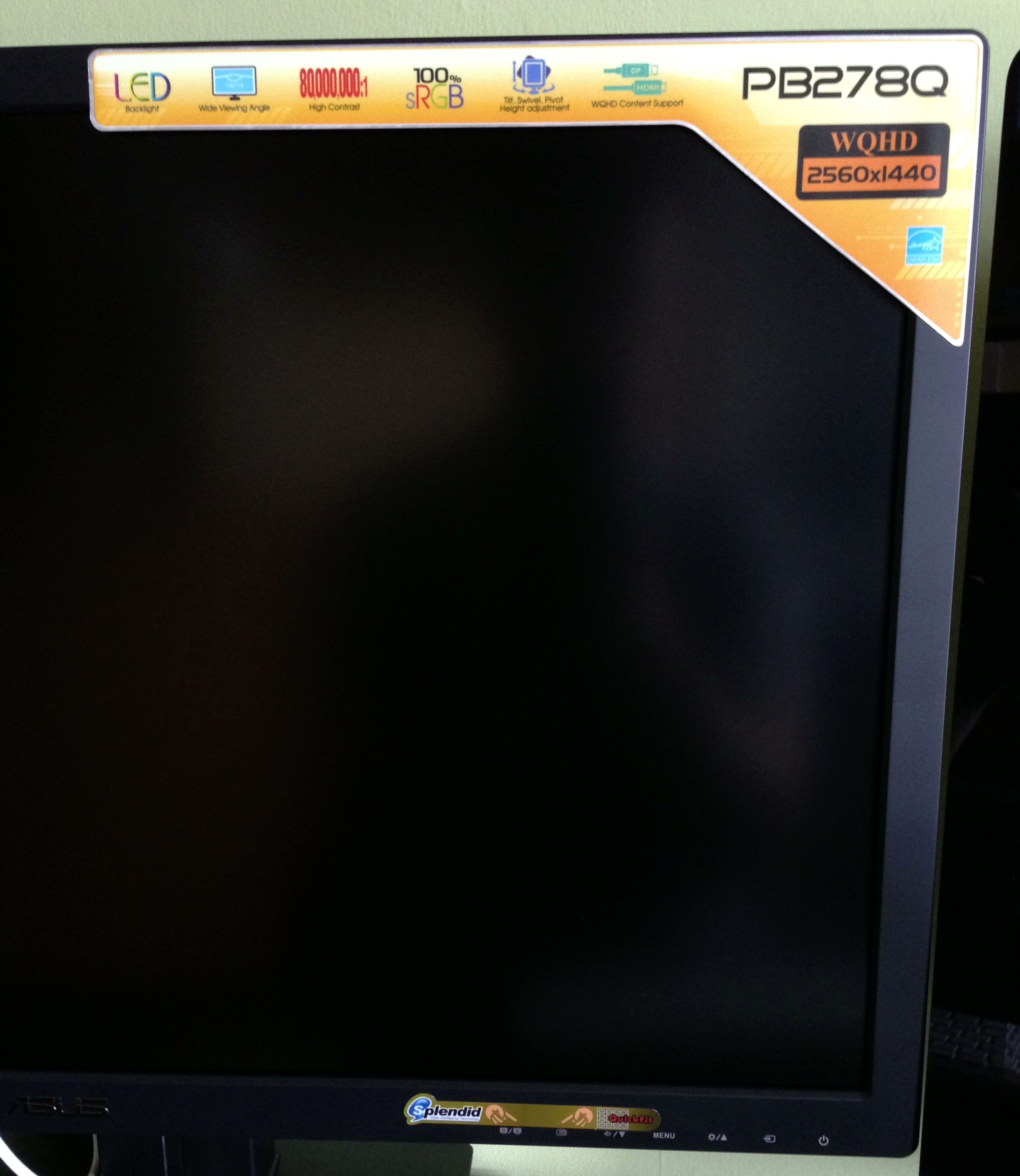
One aspect I’ve loved with the iMac is the screen. 27 inch and with a resolution of 2560×1440 it’s been a joy to use. Despite it’s size though, I’ve often wished for more. A second screen would really help day to day and especially with the podcast. After thinking and researching for a while I finally plumped for the Asus PB278Q.
Why do manufacturers persist with tacky stickers?I’m quite picky about the kit I use and while it would have been fine I’d have always been a bit ticked off with a physically smaller second screen or one with a lower resolution. The Asus is a 27 inch screen which is the same size as the iMac and also shares the same resolution – 2560×1440. Another obvious choice would have been the Apple Thunderbolt Display but that costs £899 and has no flexibility when it comes to adjusting screen height. The Asus is fully adjustable and can be rotated 90 degrees too. It also cost £467 from Amazon which is a massive difference to the Apple Thunderbolt. Other options were from Dell and Samsung. Although Dell have been making monitors for years looking at recent reviews and also customer comments on Amazon there seems to be an issue with quality control and although most were happy with the product, there were too many who had real issues with their monitors. As for Samsung, it didn’t look the best, the Asus had far better reviews…and it was a Samsung :-). First impressions out the box were good. Design wasn’t a patch on the iMac but it was sturdy with a good base. The only initial negative was the garish stickers that PC manufacturers love to put on cases, laptops and monitors. Thankfully they were easy to remove leaving just the button indicators, the ASUS logo and the unnecessary HDMI and DisplayPort logo’s on the front. When will they learn. The material is black matte plastic and although the bezel is a touch larger than I would have liked, it does melt into the background in use.
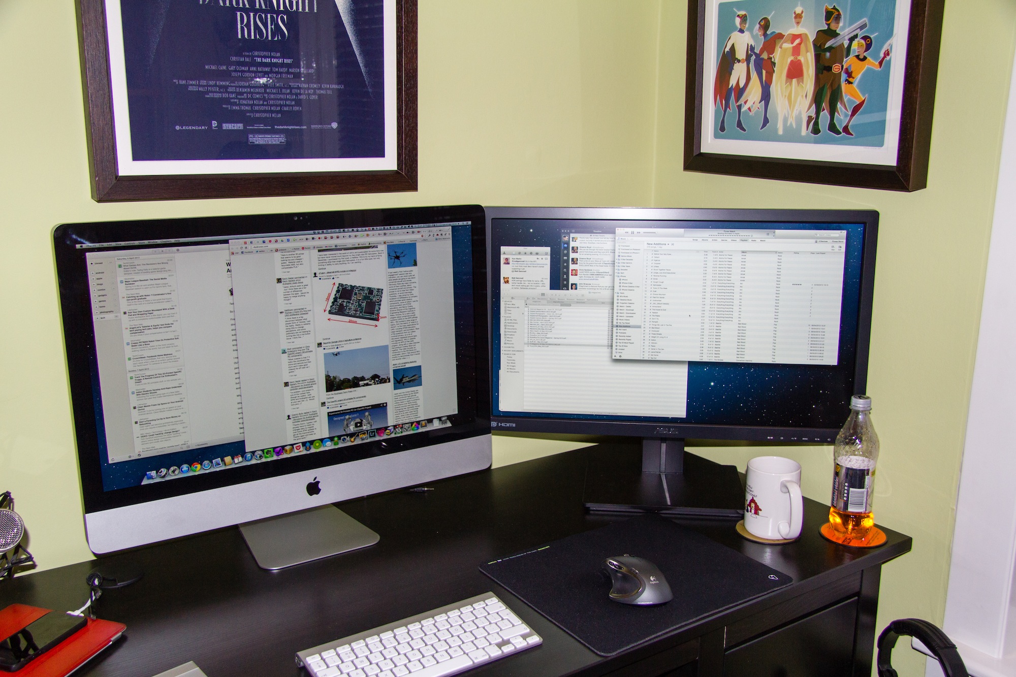
iMac and Asus – look small in the pic but they are both 27 inch screens
The Asus comes with lots of connectivity options – HDMI, DisplayPort, VGA and DVI and admirably comes with a full set of cables in the box. However for the iMac I needed an mini-DisplayPort to DisplayPort but there are some great sub £10 options on Amazon. Setup was easy. Plugin the cable, power up the monitor and the iMac auto detected the screen and enabled an extended desktop giving a total resolution of 5120×1440. Thats a lot of pixels and brings me to my biggest fear when it comes to screens. Dead pixels.
I shouldn’t really check as chances are in day to day use it would be unnoticeable…unless you go hunting, but hunting I went. Happily the Asus has no dead or stuck pixels. The screen itself is more matte than the iMac so reflections are much reduced. As for the screen itself I think it’s excellent. Clear and crisp, no noticeable lag with my ageing eyes and I can use it easily all day long without any tiredness. Applications were well sized, nothing too small or unclear and full screen video was crisp and clear – no smearing that I could see. I don’t really game too much on the Mac although have been bitten by the emulator bug over the last couple of weeks, but that’s for another post, but the games I tried all played well.
The menu controls are easy to use and give you full control over screen colour, brightness etc and also allow you to flick between a number of presets. It was straightforward to match the iMac display so it looked roughly the same to my eye’s. You can also control audio levels as the monitor has built in speakers which are ok, but nothing spectacular. You can alter menu positions, menu language and also turn off the power light indicator which makes the display on the front of HDMI and DisplayPort logo’s even more annoying. I might have to find some black tape. Apart from that I’ve nothing more to say technically about the monitor and I’ll point you to TFT Centrals review of the PB278Q which is incredibly detailed and covers all aspects of the monitor. Suffice to say, they liked it.
I’ve had the monitor for a week now and love it. It’s a luxury purchase but delivers a big gain in productivity. 2 years ago I was sure I didn’t need anything more than a 27 inch monitor, I’m now pretty sure that I don’t need a third monitor…but in 5 years time will it be two retina monitors? Time will tell.
I was asked recently what podcasts I listen to, so in alphabetical order…
Above & Beyond: Group Therapy (iTunes link) – Weekly 2 hour mix show, highlighting the finest in trance. Great for getting through boring tasks at work. We all have them!
Accidental Tech Podcast (iTunes link) – Relatively new technology (especially Apple) podcast featuring Marco Arment, Casey Liss and John Siracusa. Can go deep on topics but really enjoyable so far.
All About Android (iTunes video link) – Weekly show that features news and app’s from the world of Android. Great way of keeping up to date.
CMD+Space (iTunes link) – A tech interview show from Myke Hurley. Had a great run of guests making this a really enjoyable show – Myke has real skill at getting the most out of his guests too.
The Crossover (iTunes link) – Hosted by Dan Benjamin and featuring a variety of hosts from 5by5 discussing…anything. Great episodes so far.
Fighting Talk (iTunes link) – Colin Murray hosts, 4 guests from the world of sport and 50 minutes of comedy gold.
Foundation (iTunes video link) – Kevin Rose interviews founders, entrepreneurs and business leaders in the tech community. Roughly a monthly release cycle, Rose has had access to some great people over the years.
Frame Rate (iTunes video link) – How to watch Internet TV and what’s worth watching right now. Tom Merritt and Brian Brushwood are great hosts.
Mac Power Users (iTunes link) – Hosts Katie Floyd and David Sparks take one topic each week and discuss it in detail. Mac focussed and some great software links and tips to get the best out of your Mac.
MacBites (iTunes link) – MacBites is hosted by Elaine Giles and Mike Thomas and is that rare beast – a UK podcast! Informative but great fun at the same time – I love it. Weekly but with frequent breaks, their absence kicked me into doing DigitalOutbox.
Macbreak Weekly (iTunes video link) – A once classic podcast when Merlin Mann took part, stil watchable thanks to Andy Ihnatko and Rene Ritchie. Can go long…too long.
The New Disrupters (iTunes link) – Hosted by Glenn Fleishman this podcast focusses on how the economy is changing and each week he interviews a disrupter who is taking advantage of the new economy.
On The Verge (iTunes video link) – Monthly video magazine from The Verge, part gadget reviews, part chat show with great guests.
Shift Run Stop (iTunes link) – Much loved and much missed, a geek/comedy podcast hosted by Leila Johnston and Roo Reynolds. Tech, gaming, geek culture, UK based and two delightful hosts. And fun.
The Talk Show (iTunes link) – Hosted by John Gruber each week he discusses mostly Apple related subjects with a guest or two. Miss the old days with just him and Dan Benjamin.
This Week in Google (iTunes video link) – Jeff Jarvis and Gina Trapani discuss Google and cloud computing in general. Jeff is great – really refreshing voice.
This Week in TECH (iTunes video link) – Can go long and is very much dependant on the guests but is generally a good round up on the weeks tech news.
Top Shelf (iTunes video link) – David Pierce from The Verge looks at a variety of tech and gadget issues. New but good so far.
So thats what I currently subscribe too. I dip into others as they are linked or mentioned elsewhere and of course I couldn’t write a post on podcasts without mentioning DigitalOutbox in which you can hear my good self and friends ramble on about the weeks tech news but with a distinctly UK focus.
I love finding new great podcasts so if you think there is something I would like please leave a link in the comments.
The Pebble was the first campaign I backed on Kickstarter. It was April 2012 and the Pebble was a breath of fresh air. A watch that would talk to your phone, iOS or Android, that was updatable, not too large, had a good battery life and was affordable at around $100. There wasn’t much not to like so I backed it without much hesitation. It was geeky but I love geek toys!
Despite missing a couple of delivery dates the Pebble team have delivered on their oversubscribed Kickstarter and on Thursday my watch finally arrived. Kudus to the team as they have kept everyone up to date on progress their problems and issues of scale that I’m sure they didn’t expect just under a year ago. So after a couple of days how does the Pebble deliver?
The Good
The watch itself is light and feels good in the hand. It has one button the right hand side and three buttons on the left. The buttons are used to navigate around the menus, dismiss notifications, turn on the backlight etc. The buttons need a firm press to operate which I’d expect to ease over time but gives confidence that the watch is well made.
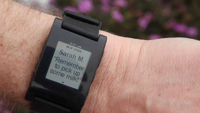
Pebble notification
The Pebble has to well made as it’s waterproof hence the contact power connector. Powered via USB the cable attaches via magnets and powers the Pebble quickly. Battery is rated at 7 days and as I haven’t had it that long it’s hard to know if it’s accurate – it’s still going strong after three days so the signs are good.
The Pebble is easy to connect to your phone on iOS or Android. Via Bluetooth you pair the phone with the Pebble and…thats it really. On iOS you need to make sure that Notifications are enabled and setup properly. For me it’s worked well but it’s a bit of a pain and not the best setup experience. That’s not Pebble’s fault – iOS is more locked down than Android so you won’t get everything you expect. It can also disable if the devices go out of range which I’ve seen once. Pebble have a useful page to help with iOS setup. The music app worked really well – skip tracks, pause – all good.
On Android the Pebble app works differently in that everything routes through the app and it runs permanently. More seems to flow through on Android but it does feel a bit of a hack to get the most out of Pebble.
Speaking of hacks to get all iOS notifications then you can jailbreak your iPhone and from Cydia install BTNotificationEnabler by Conrad Kramer. So instead of just Messages, Phone and Music you will get Tweets, mails – everything. It’s an impressive hack and with the recent evasi0n jailbreak it’s an easy method of improving the Pebble on iOS.
The Not So Good
The screen is clear but duller than I expected. The backlight helps but switches off quickly. It’s also quite blue with the backlight on but thats not a biggie. The viewing angle is narrower than I’d expected but really is fine, just not great.
The strap is a bit industrial but as it’s a standard size it’s easily replaced. Also industrial is the Pebble itself. While not massive like some of the GPS walking/running watches it’s quite tall. Certainly on my wrist I found it quite uncomfortable especially under a work shirt finding it awkward to see the full notification and then clear it.
Pebble Icon
Pebble gets it update via the software installed on the phone. With an update every couple of weeks planned by the Pebble team you can be sure of a watch that will only get better. That doesn’t get away from the fact that at the moment it’s use is limited. The one feature that really appealed to me was RunKeeper support which unfortunately isn’t yet available. In fact from the Pebble front page it’s only notifications and Music that is available.
The menu on the Pebble itself is at best utilitarian but is in need of updating. Clock faces are listed in the top menu alongside Music and Settings. The faces really need their own menu as adding a new clock face clutters up the menu.
One last software issue is that there is no battery indicator. While the watch lasts for seven days without an indicator you have no real option but to charge more often than is probably necessary. Seemingly the battery only appears when it needs charged, but thats no use if you are away for a couple of days and it appears on the second day. For Pebble to succeed it has to be trusted and I can see a future update enabling a visibile battery indicator, or at least a way of checking it in the menus.
Verdict
The Pebble is a great watch. It has so much potential and for a first product the team should be rightly proud. However now that they are shipping hardware in volume they need to focus on delivering app’s and polishing the software. Without that users will quickly tire and the danger is an Apple, Google or Samsung will come along and almost instantly kill their product.
For me the Pebble in it’s current form has parallels to the first iPhone. It was clearly a wonderful phone but without 3G and app’s it wasn’t enough for me to buy…and thats how I feel about the Pebble. Right now the form factor and usability coupled with the lack of app’s means it’s not for me so I’ve sold mine on eBay. However I wouldn’t rule out picking up a future Pebble or smart watch from another provider. Imagine a watch that could do everything that the Pebble does coupled with a Fitbit and a slightly better screen. Add in a touch screen and I’d be first in line. It will be interesting to see where the wearables sector grows to over the next 2-3 years and whether it’s a market just not for geeks. Is the smartphone good enough for the majority of users?
I’ve been an iOS user for 5 years now which is natural as I also use Macs. I love the devices and software but in doing the podcast and seeing so much momentum with Android I had an itch – I really wanted an Android device to play with. I didn’t want a phone as that would involve a contract and I didn’t want a device that had a companies UI grafted on top of vanilla Android. So when the Nexus 7 was launched it seemed to be the ideal device for me to get. The price drop/increased spec’s at the start of November made the choice even easier so I picked up a 32GB Nexus 7 in the middle of November.
As I already have a iPad and iPhone 5 (both new this year) it’s definitely a luxury purchase as it wasn’t as if I had a gap in my gadget library but it has allowed me to compare the different form factors and understand their strengths and weaknesses. What I was most interested in was the software – how good is Android now that Jelly Bean (Android 4.2) is launched and how strong is the third party support? I hate the iOS vs Android posts on the web as the two camps are so entrenched it’s hard to get a view that’s accurate. At least buying the Nexus means I can form my own view and I can also be more informed about Android. I’m also a geek so it was a brand new device and ecosystem to enjoy.
Nexus 7 Hardware Nexus 7I’m not going to cover the Nexus 7 hardware in detail but just mention some highlights. For a full review I’d read The Verge review from June 2012. So what do I like about the Nexus 7?
Ever since Steve Jobs dissed the 7 inch form factor there has been a debate about their value. For me the 7 inch Nexus is an excellent size for a tablet. I can hold it in one hand and read from it easily. I’ve not had an issue with touch points or that my hands are too big for the screen. Indeed Apple bringing out the iPad Mini shows that Jobs ire was more to do with competition to the iPad rather than a 7 inch tablet is too small.
The screen quality is excellent. Much is made of retina screens but I find the text quality on the Nexus 7 is great. No eye strain and no visible pixels either. The screen is 216 ppi which is less than the 264 ppi that the iPad has but similar to the Macbook Pro which has a ppi of 220. One point to note is the screen felt washed out at first. I found that having the brightness set to automatic set it far too low and my current setting is around 40-50% which is ample for me. Video playback is excellent too – it’s a great device for watching video’s on but more of that later.
The weight is excellent. I think this is the biggest advantage over an iPad. I can hold it in one hand, I can read easily on planes, at work or around the house without getting arm fatigue and unlike the iPad the weight is just not an issue. It also feels good in the hand with a grippy dimpled plastic back which makes it less likely that you’ll drop the Nexus.
Overall build quality is good but not quite to the same standard as Apple but it is a lot cheaper that the iOS devices. It never feels cheap though – considering it’s only £160 for the 16GB version it’s a steal at that price.
Landscape mode isn’t the best. It feels squashed and I find it difficult to work in that orientation unless it’s for watching a film. Limitations of a 7 inch tablet with this form factor.
The 7 inch tablet is great for reading, watching video, Twitter et all but I do have issues with it as a work device or content creator. The iPad can do all those things but I found the screen just to small in landscape to create anything useful. Another issue is the lack of software written specifically for Android tablets. More on that later.